Launching the New Smirk: Branding, Website & Concepts
Why Rebrand Now?
As Mufasa once said, it is time.
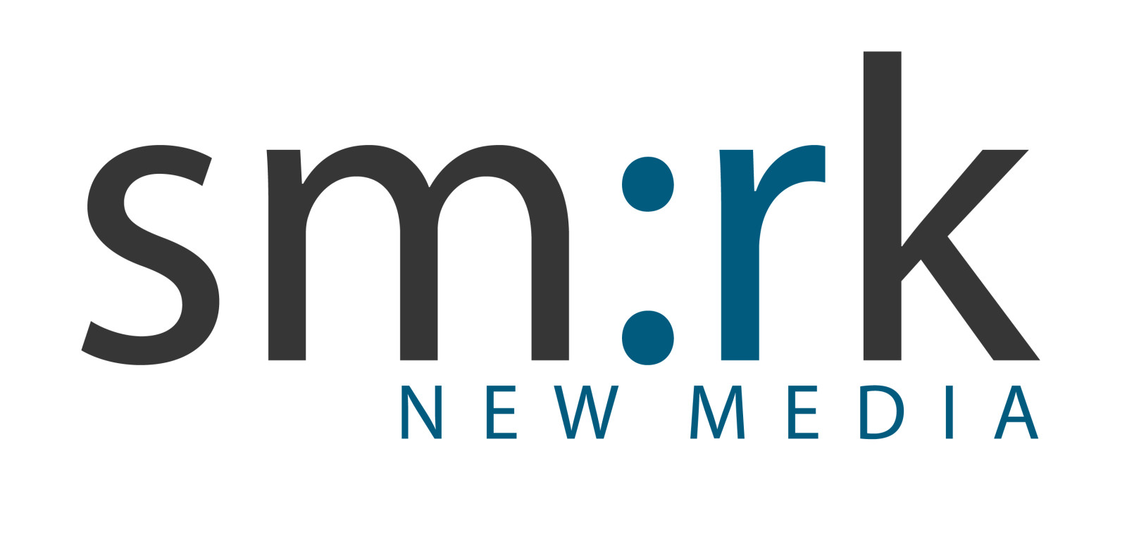
Like most startups, our branding fit who we were at the beginning. A lot about Smirk has changed. We got our start offering social media marketing clients “words on the web.” It’s hard to believe now, but our first clients could strike social media gold with just the turn of a phrase.
Over the years, online platforms became more interdependent. Effective digital strategies required a holistic approach to managing a brand’s digital presence across the web. With new client partnerships, Smirk’s team grew and our expertise expanded beyond social media to include most digital marketing solutions. As visual content began dominating online, we set our moon shot to offer expansive graphics capabilities in-house. Smirk became a full-service digital agency in the spring of 2018, adding creative services, including branding, motion design or animation, graphic design, illustration, and video production.
With a pro at the helm of our creative strategies, Rachel Haynes, we decided to rebrand because our original logo felt increasingly stiff. It no longer reflected our full capabilities, culture or values.
How Did You Create This New Brand?
We started the rebranding process with an extensive, team-wide discussion about our goals, thoughts, and inspiration for the project. We wanted our new brand to be more friendly and approachable as well as reflect our whimsical culture.
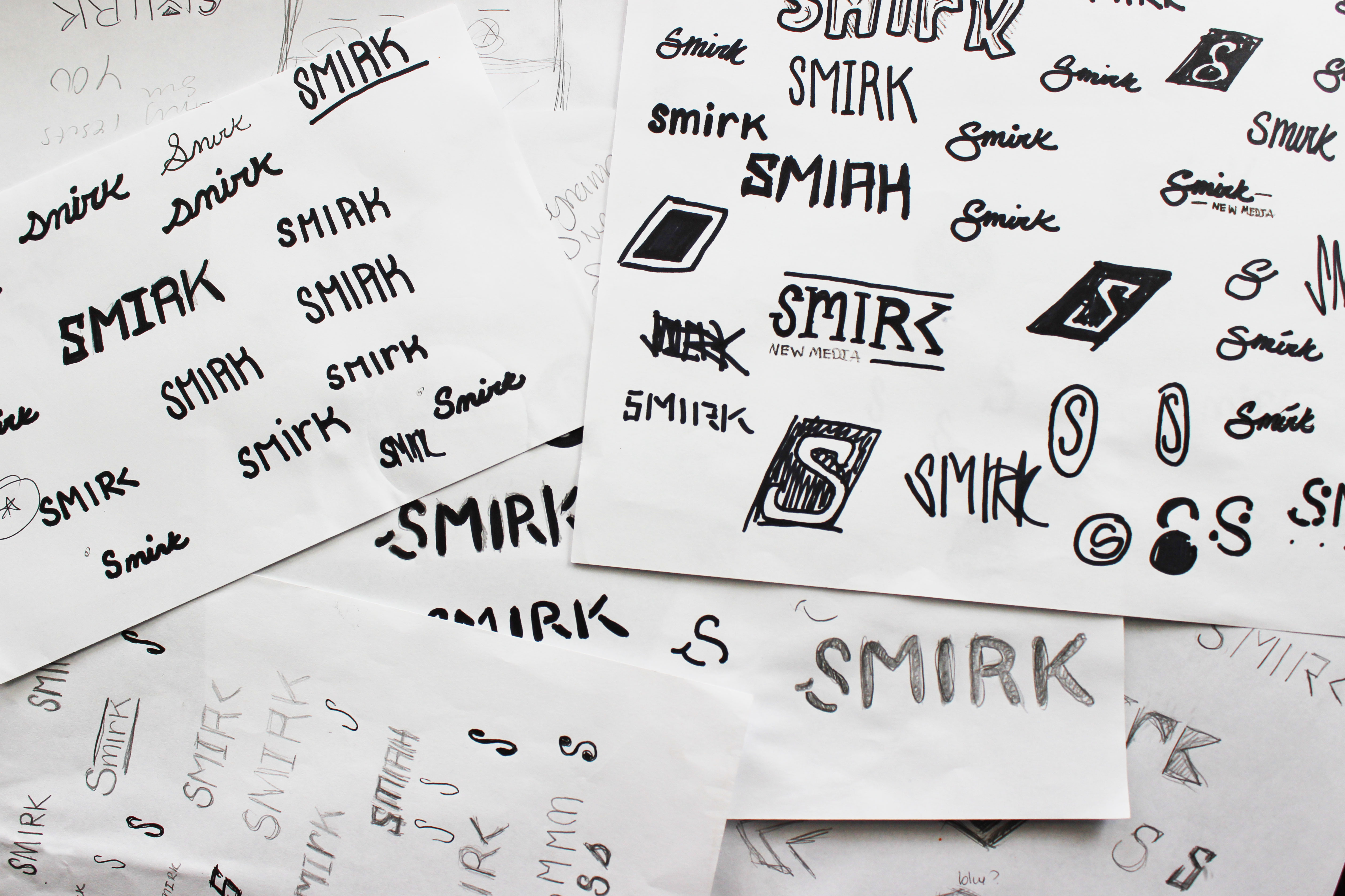
Our team put a lot of work into this process. Rachel began researching and formulating our new brand identity. She created dozens of sketches exploring logo possibilities. She mocked up several promising options for review and discussion. When we narrowed in on our final choice, she created dozens of variations for the leading contender to help ensure that the most fitting iteration of her designs would represent our brand. We kept an open mind throughout the process, but each variation cemented our choice. We were excited our new logo would actually Smirk.
The Smirk Works
Around our office, we regularly refer to a concept called “The Smirk Machine” as a way to describe our process for digital marketing. This concept points to Smirk’s refined strategy development systems that convert client problems to solutions. Through the rebranding process, we kept coming back to this machine concept as a larger illustration of the Smirk we are today.
Smirk has morphed from a one-person operation into a well-oiled team-machine since our founding in 2010. Smirk has a particular perspective on almost everything — strategy, content marketing and agency operations — everything we do runs through that filter. In brainstorming for this project, the Smirk Machine became “The Smirk Works,” the inspiration for our new website and marketing materials. We’re working hard for our clients and we want them to expect The Smirk Works in everything we execute.
New Website
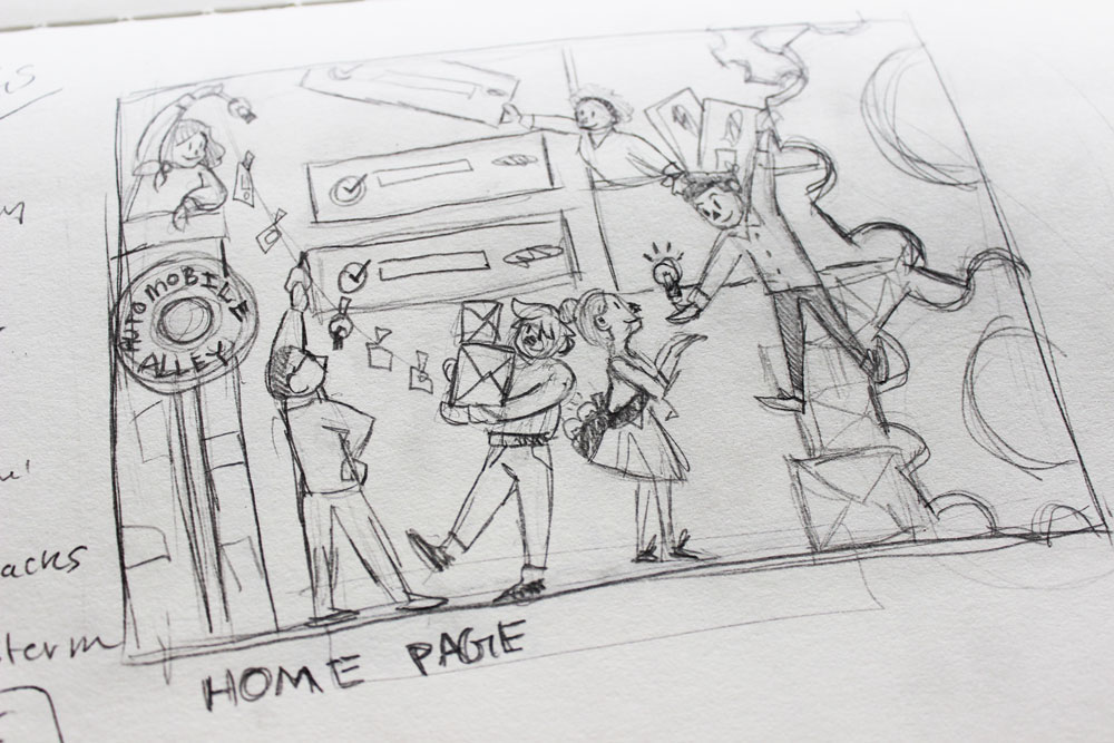
Our former website was a standard brochure site. We recognized the opportunities to fully showcase our vibrant culture, values and The Smirk Works concept within a new website. Rachel created an original illustration style for our brand with influences from steampunk, science fiction that incorporates technology and aesthetic designs inspired by 19th-century industrial steam-powered machinery. Within the illustrations, we wanted to showcase how each component of our agency acts as a gear in Smirk’s work for clients.
Our new Client Journey helps us dig deep into what makes a business tick and is the gas that powers our digital strategies.
The Smirk Difference breaks down what sets us apart, the virtues and values that influence our actions as well as the harmful industry violations we avoid.
Our Team is the most essential piece of The Smirk Works, they’re the engine of our strategies and content work.
Easter Eggs
Where’s Waldo fans, this one’s for you. Within the original illustrations on the mobile site and animations on the desktop version, we’ve hidden Easter eggs with special meaning to our team, office and culture. We’re keeping a few secret nods to ourselves, but look closely and you’ll see:
- The orange couch from Mike and Allie’s office at Smirk HQ
- The dogs of Smirk
- Our hashtag and @ wall signs
- An Automobile Alley sign (the Downtown OKC district our office is located in)
- The OKC Skyline and Wheeler Ferris Wheel
- The Twitter bird
- A bowling ball, the Smirky Turkeys’ bowl to win
I’m so proud of our team and thankful for their hard work to make this rebrand happen. Special shoutout to Rachel Haynes for her creative vision on this project. We are thrilled to release the new Smirk branding and website into the universe. We hope you enjoy it. Please let us know if you like what you see and if you’re interested in elevating your brand too.
2 Comments
Recent Posts
Top 10 October 2023 Social Media Updates
The new year will be here before we know it! Now's the time to reflect on how your biggest marketing initiatives have performed over the last year, from social media posts to ad campaigns. Take the time to identify the areas that you excelled at and where you can find...
Get to know Zachary, Smirk’s Newest Digital Content Specialist
Hello! I’m Zachary, Smirk’s newest Digital Content Specialist. I am excited to join the Smirk family and embark on a fantastic journey with my fabulous new teammates. Here is a little bit about me. Early Adventures I grew up in a small town called Choctaw, Oklahoma. I...



Dig the new logo nice play on the S
thanks chad!