The Anatomy of a Perfect Welcome Email

The average open rate for a welcome email is an astounding 82%, while open rates for all other emails across all industries is only 21%. You can’t throw away your shot to reach your most captive audience. In this blog, we’ll outline the components of the perfect welcome email and the most important content to include.
Elements of an Effective Welcome Email
The Header
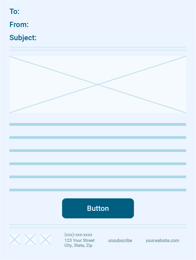
This section is the first thing people see when your email appears in their inbox. The header includes the To: and From: lines, the subject and the text preview.
To: and From: Line
When approaching the To: line of your welcome email, consider the familiarity you have with your audience and the typical level of formality within your industry. Is it appropriate to address them by their first name, full name or should you reference them as Mr/Mrs?
Next, decide if your emails are going to be from your company (such as info@yourcompany.com or no-reply@yourcompany.com) or from an individual. People may not feel as welcome to reply or engage if they see a no-reply@yourcompany.com in the From: line. Some data has suggested that using a personal name address can significantly improve net open rates. Assess what will work best for your specific brand and how personable you want to appear.
Subject
35% of consumers open emails solely based on the content of the subject line. This is your biggest chance to grab a reader’s attention. You want your subject to be personalized and engaging, but still easily identifiable. No matter what it says, make sure it’s clear that it’s a confirmation of them signing up for your email list.
Text Preview
The character limit for an email’s text preview will vary across devices, typically ranging from 40-130 characters long. It’s an opportunity to summarize the contents of your email.
Focus on what the most valuable piece of information is within your welcome email. What can you communicate in this small piece of text that will capture somebody’s attention and encourage them to click?
The Body
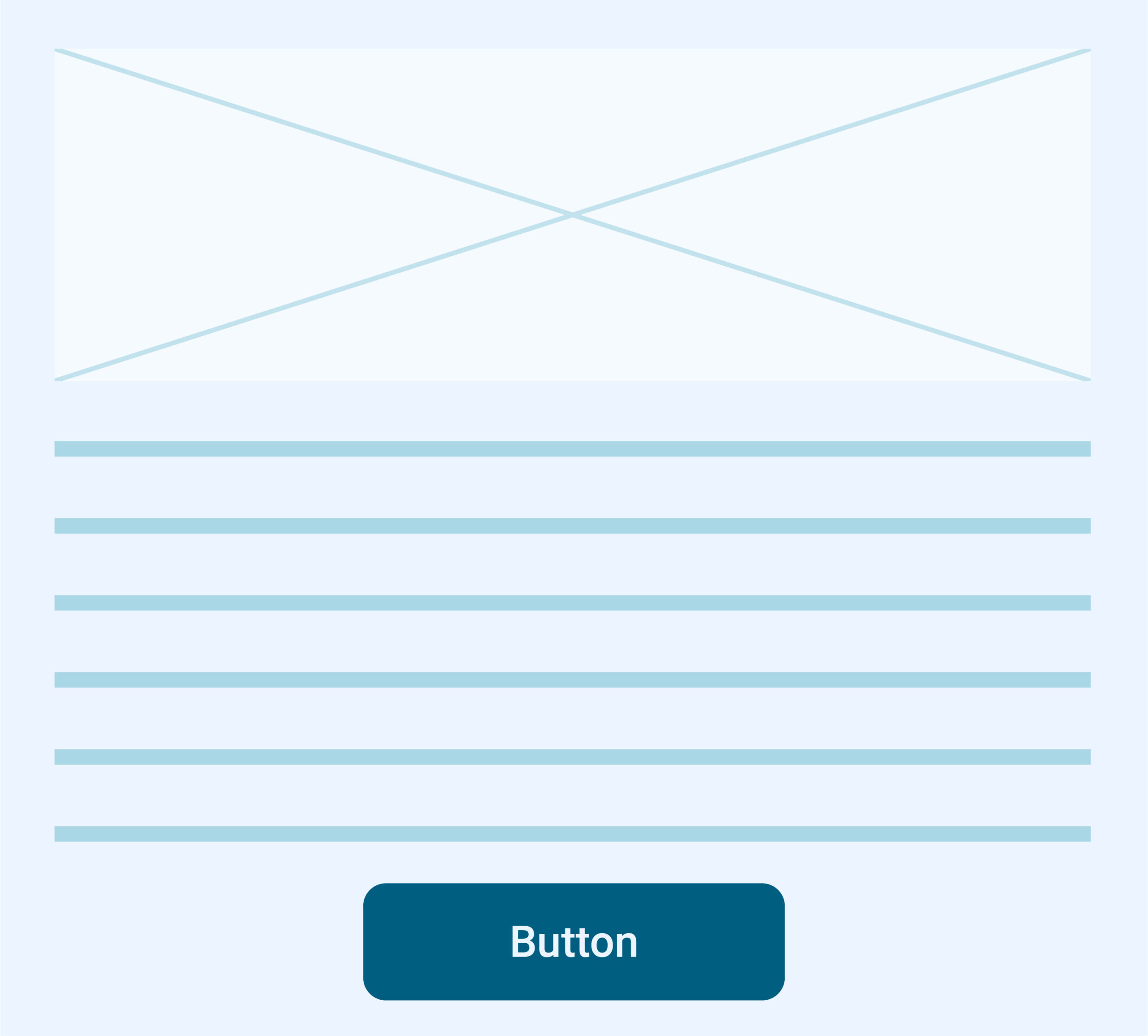
This section is the meat of your email. It’s where you’ll get your message across to your audience and prompt them to take an action. The body will include the bulk of your text as well as the CTA.
Text
Typically, welcome emails are pretty short — 65% range from 50-150 words in length. You’ve already succeeded in getting someone to sign up for your email list, so you don’t necessarily need to beg for a conversion right off the bat or to subject readers to mountains of text. There will be other opportunities in the future.
The content of this section will vary depending on what your business goals are but should remain short and sweet. You don’t want to overload your audience with too much information. Ask yourself, if I have time to emphasize one key point about what to expect from my brand or future correspondence, what is most important?
Call-to-Action (CTA)
The call-to-action in your welcome email will vary quite a bit depending on what kind of business you are. Your goal may be to get them to visit an e-commerce store or to inquire about a consultation. You should provide a clear CTA that focuses on only one action. Multiple CTAs in one email can confuse readers on the action you really want them to take.
The Footer
This closing section contains some of the most important resources within your welcome email, including your business address, phone number, social media icons, unsubscribe button and a link to your website.
Social Links
This is where you can link your most active social channels. It is a very non-invasive way to encourage people to interact with your brand outside of your website.
Unsubscribe Option
Displaying an option to unsubscribe from your emails is not an option — it’s a legal obligation that most major email platforms make mandatory to use their service. The unsubscribe link is typically accessible at the bottom of most emails.
Link to Website
It’s standard practice to include a direct link to your website in the footer of all emails. No need to make subscribers go on a hunt to find it elsewhere.
Not Seeing the Results You Want?
Email remains one of the best places to reach your audience, with 91% of consumers checking their email every day. Further, 46% of emails are opened on a mobile device, and a whopping 69% of those emails are deleted by mobile users if they aren’t optimized for mobile viewing.
It’s so important to execute this first touchpoint with prospects as effectively as possible. Having an email marketing strategy that isn’t optimized means you’re missing out on developing a relationship with your customers. Smirk builds custom email marketing funnels that are creative, prospect-focused and effective at nurturing customers.
Schedule time to chat with us about how your email marketing strategy can develop relationships that convert prospects to customers.
Recent Posts
Top 10 October 2023 Social Media Updates
The new year will be here before we know it! Now's the time to reflect on how your biggest marketing initiatives have performed over the last year, from social media posts to ad campaigns. Take the time to identify the areas that you excelled at and where you can find...
Get to know Zachary, Smirk’s Newest Digital Content Specialist
Hello! I’m Zachary, Smirk’s newest Digital Content Specialist. I am excited to join the Smirk family and embark on a fantastic journey with my fabulous new teammates. Here is a little bit about me. Early Adventures I grew up in a small town called Choctaw, Oklahoma. I...


0 Comments