By Michaela Lawson
“We need to stand out a little more. Any ideas?”
“Change the font.”
“Change the layout.”
“Change the logo.”
“Change it all!”
“Let’s break the Internet today.”
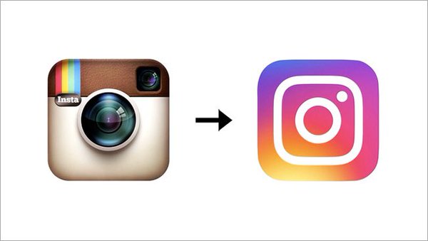
That’s about how I imagine the conversation went at Instagram’s headquarters last week, before the unveiling of their new layout and logo. The iconic brown camera we knew and loved has been replaced with a simplified white line camera imposed over a “rainbow gradient.”
“Let me be perfectly clear, I think the new Instagram logo is an epic monstrosity. I thought color gradient screens went out sometime during the Clinton Presidency. But alas, there it is sitting on my home screen like some rainbow Cyclops.” – Mike Koehler, President and Chief Strategist
It’s a classic case of trying too hard to cause waves of news among fans and media alike. While rebrandings and logo refreshes are often useful and needed, the public outcry regarding Instagram’s remodel is simple: you did too much at once.
The image-sharing platform was known well for its logo, and a modern simplification and refreshed version of it would have likely been received quite well. Most users have agreed that the updates inside the app are great – new font, emphasis on photos, simplified buttons, etc. It’s the logo change itself that has everyone in an uproar.
But how do you know if your logo has reached the level of identifiability in which changing it would cause outrage, rather than a warm welcome? When should brands revamp, rebrand or reimagine their logo? And what value can it bring audiences?
The Smirk team responds:
“Rebranding is something that is necessary – you shake things up, spice them up a little. However, I do think that brands need to be very cautious when rebranding because many will already have a set identity. … I think rebranding is more to “freshen things,” making them more modern and relevant to the world today.” – Liz Ramirez, Strategist
“The logo is the visual symbol of a brand’s identity. That visual creates a sense of trust and familiarity in the minds of your audience. Making a logo change is a big deal and should only happen if it’s necessary to revitalize your brand, increase recognition or eliminate an outdated look that isn’t resonating anymore.
If you’re a well-known brand and decide to make a change, keep in mind: social media will probably hate it. Rebranding causes reflexive reactions and those are often negative. Don’t change course based on the immediate reaction, listen to your audience, be responsive and transparent about the reasons behind the change.” – Allie Carrick, Managing Director
“Why do brands poke and prod their logos? Sometimes I think it’s to add some freshness or reinvent themselves when the brand might be taking a new turn. I’m all for that. One thing to do though is to run that new logo past some normal people instead of falling in love with your own genius, which seems to happen a lot. Make sure your logo means something in a not esoteric way, and for goodness sake, hire a professional.” – Mike Koehler, President and Chief Strategist
“I think a brand updating their logo is most effective when they’re rolling out other big changes … Like a website or an app interface, I think good design is rolled out in incremental changes rather than a total overhaul.” – Kailey Emerson, Business Development
Instagram communicated that the reason for the logo change was that “the Instagram community has evolved over the past five years from a place to share filtered photos to so much more — a global community of interests sharing more than 80 million photos and videos every day.” The went on to say that the company’s “updated look reflects how vibrant and diverse your storytelling has become.” To that, we say:
“While Instagram has evolved as a platform since its inception, its original logo was iconic and identified them as the digital equivalent of Polaroids. I think Instagram made this change without any substantive reason to do so and sacrificed an iconic visual brand association for something that looks like elementary level spin art.” – Allie
“I am not too keen on the Instagram revamp because I’m not sure if it correctly represents their brand. This past when I’m scrolling through my phone, I always over look the Instagram app because my brain is not used to the change. I think most people have negative reactions to logo changes because it is never explained why there is a change in the first place. If you get your loyal audience involved, the change won’t be so shocking.” – Samaiyah Islam, Strategist
“You don’t have to reinvent the wheel every time you change something in the app. Brand overhauls make sense occasionally, but the Instagram update was not one of these occasions. A simpler, more modernized version of what Instagram already had would have been a much better option to roll out the new internal updates from the platform. Keep it simple, but keep it recognizable.” – Michaela Lawson, Strategist
“From a sales/marketing perspective, I think the redesign was genius because people are talking about the app. And I would be willing to bet they had a lot of people opening that app just to see what was new or changed.” – Lennon Patton, Business Development
With logos being at the forefront of any company – but especially those with apps – redesigns require a lot of thought, conversation and transparency for them to be received well by the public. Involving your audience with your company’s decisions is a very practical modern day phenomenon that makes your fans feel closer to the behind-the-scenes daily grind at your company. Don’t neglect your loyal following and remember how your decisions affect the ones who got you to where you are today.